Building an LCARS-Inspired Niagara Launcher Theme
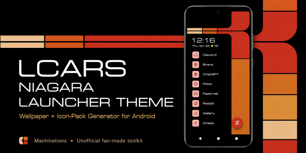
This project started because I wanted my phone to feel more like an actual designed interface instead of just a pile of app icons.
I have always liked the LCARS style from Star Trek. It has this weird mix of being futuristic, colorful, chunky, and organized all at the same time. It does not look like a normal modern phone UI at all, which is part of why I like it. It feels like an interface with its own world behind it.
So I started working on an LCARS-inspired setup for Niagara Launcher.
At first, it was basically just me trying to make my phone look cool. But the more I worked on it, the more it became a real design project: wallpapers, icons, layout choices, readability, color balance, accessibility, and trying to make the whole thing feel like one coherent system.
Why Niagara Launcher
Niagara Launcher made sense for this because it already has a cleaner structure than a normal app-grid launcher.
With a standard launcher, it is easy for a theme to get messy fast. You have icons everywhere, widgets everywhere, and the whole thing can start looking like decoration pasted on top of chaos.
Niagara is simpler and more focused. The app list and layout already have a strong shape, so the LCARS idea had a better chance of actually working as something usable instead of just being a wallpaper gimmick.
That was important to me. I did not want this to be something that only looked good in a screenshot. I wanted it to be something someone could actually use.
What I made
The theme is an attempt to translate the LCARS feel into a modern phone setup.
That means:
- LCARS-inspired wallpapers
- matching icon ideas
- color choices that feel close to the source style
- layout decisions that work with Niagara instead of fighting it
- design changes based on actual use and community feedback
The goal was never to perfectly copy one specific Star Trek screen. It was more about catching the feeling of LCARS and making it work in a totally different context.
A phone is not a starship panel. It has different constraints. You need to read labels, find apps quickly, use it in different lighting, and not get annoyed by it after a day. So a lot of the project became a balance between “make it feel right” and “make it usable.”
Community feedback changed a lot
One of the coolest parts of the project is that it did not stay as just my private little theme idea.
I shared it, people gave feedback, and a lot of the project improved because of that. Some things that seemed fine to me at first were not as clear to other people. Some visual choices looked cool but were not as practical. Some parts needed to be more readable or better organized.
That feedback helped move the project away from just “I made a thing I like” and toward “this is something other people might actually want to use.”
That matters because design gets more real when it has to survive contact with other people’s eyes, phones, habits, and preferences.
What was hard
The hardest part was keeping the LCARS vibe without making the phone annoying to use.
LCARS is bold. That is the whole point. But bold design can become visual noise really fast on a small screen.
Some versions looked interesting but felt too busy. Some were readable but lost too much of the style. Some icon ideas matched the theme but did not feel consistent enough once they were actually being used.
So a lot of the work was iteration: try something, look at it in real use, notice what feels off, change it, share it, get feedback, and repeat.
The other challenge was that LCARS is not really designed around modern accessibility needs. It is a fictional interface style, and fictional interfaces can cheat. Real phone themes cannot. People need contrast, readable text, clear states, and layouts that do not punish them for having different vision needs or preferences.
That is the part I want to improve next.
What I learned
This project taught me that design is not just about making something look like the inspiration. It is about figuring out what actually makes the inspiration work, then rebuilding that feeling under new constraints.
For LCARS, the important parts are not just the colors. It is also the rhythm, the rounded blocks, the sense of panels and sections, the way the interface feels organized but strange.
I also learned that usability is what separates a theme from a screenshot. A screenshot only has to look good once. A theme has to keep working every time someone unlocks their phone.
That changes the whole design problem.
Next steps
The main next step is accessibility.
That is the big thing I want to improve from here. I want the theme to be easier to use for more people, especially around readability, contrast, and visual clarity.
I do not want to just make something that looks like LCARS. I want to make something that keeps the LCARS feeling while becoming more usable and more considerate of different users.
That is probably the next real design challenge for the project.
Links
- GitHub:
[GitHub link here] - Project webpage:
[webpage link here] - Niagara Launcher:
[Niagara Launcher link here]
Final thoughts
This started as “I want a Star Trek phone theme,” but it turned into a much more interesting project than that.
It became a way to practice interface design, community feedback, visual consistency, and the problem of turning a strong aesthetic into something people can actually use.
I like that kind of project. It starts with something fun, but then it slowly becomes a real system.
And honestly, that is probably why I kept working on it.